
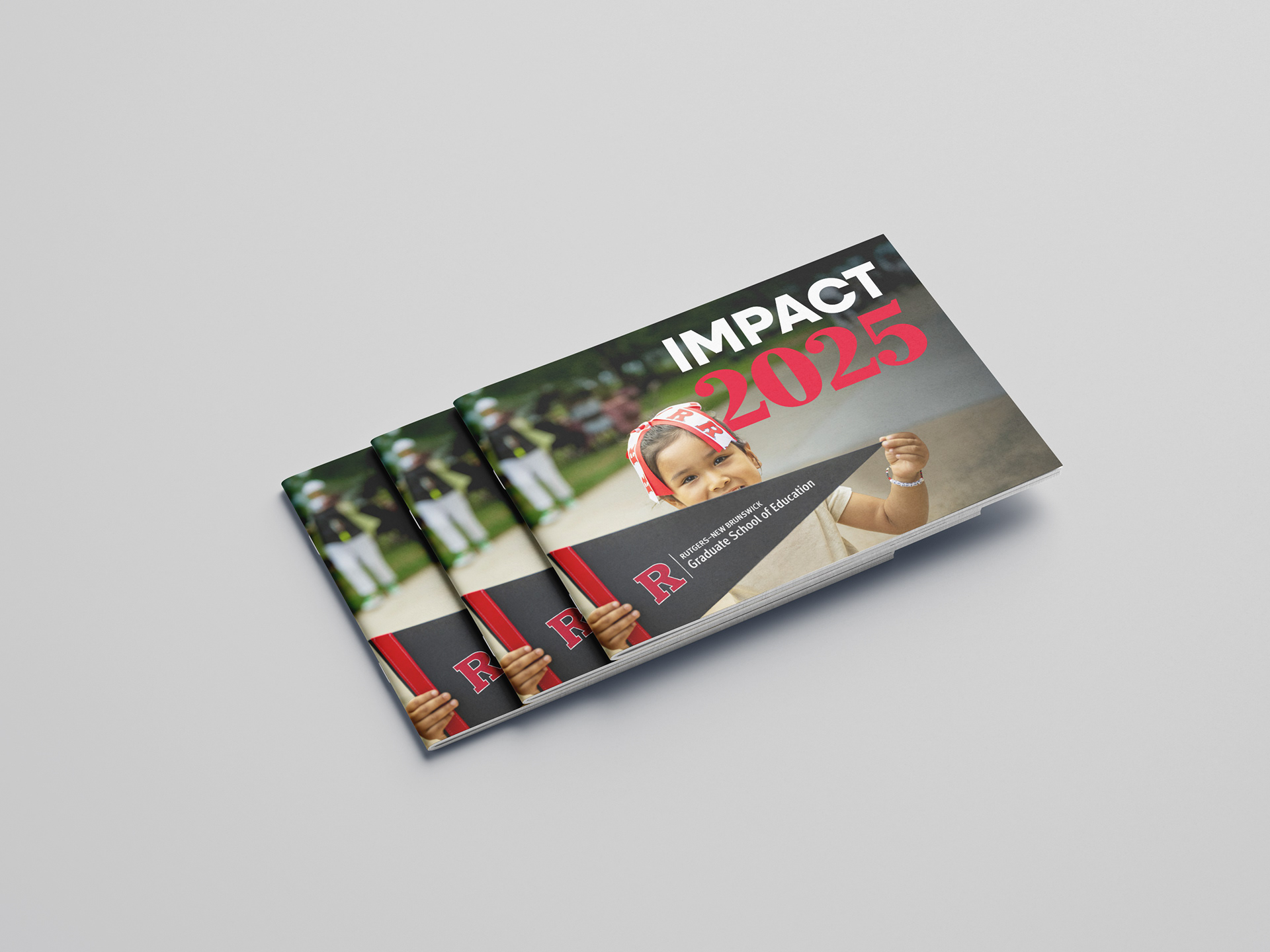
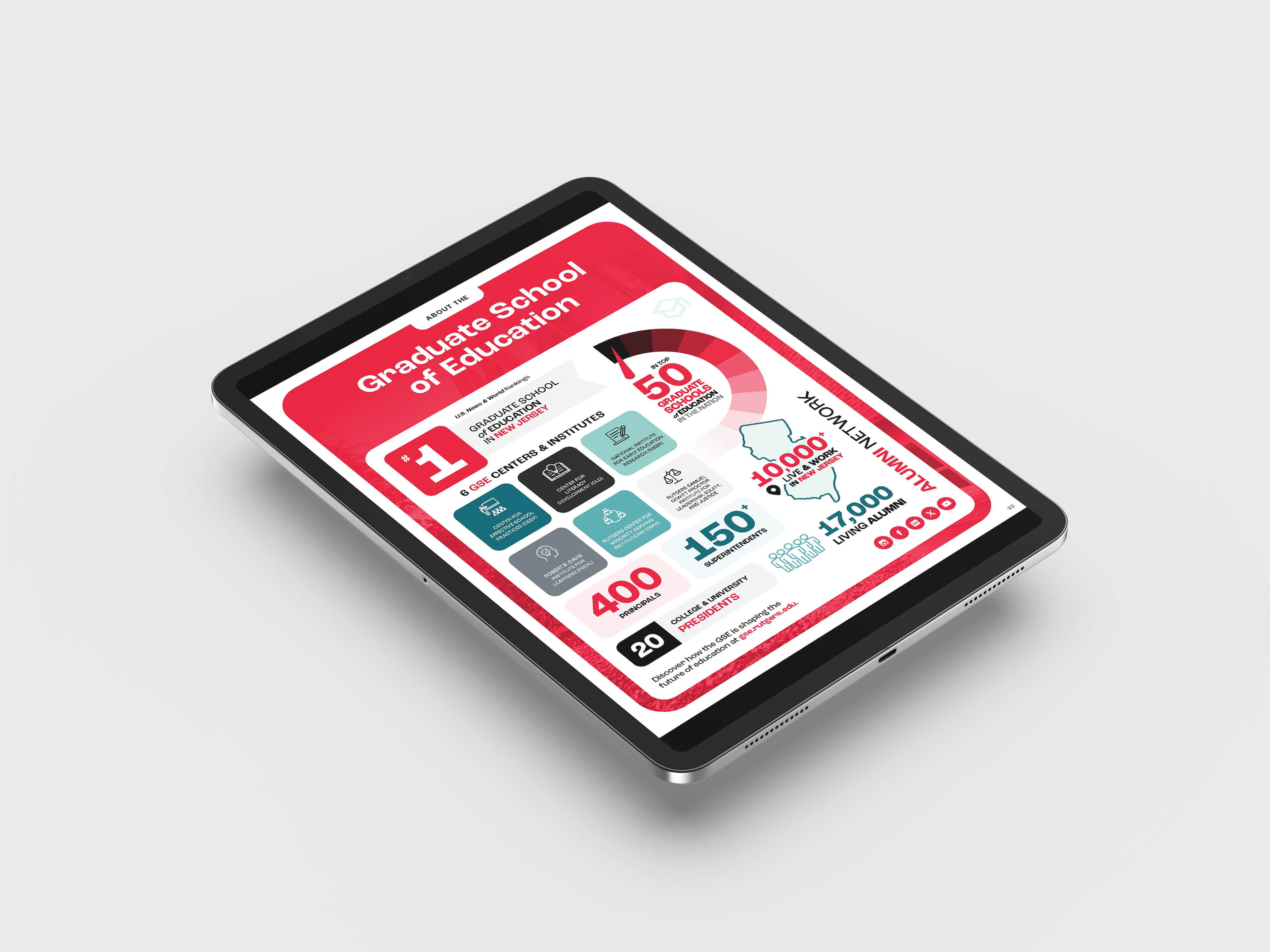
The Rutgers Graduate School of Education (GSE) is the #1 graduate school of education in New Jersey and is ranked in the top 50 graduate schools of education in the nation.
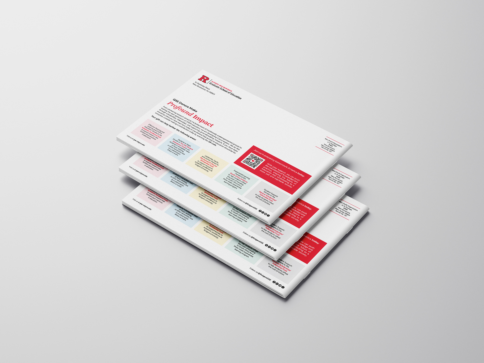
Impact 2025
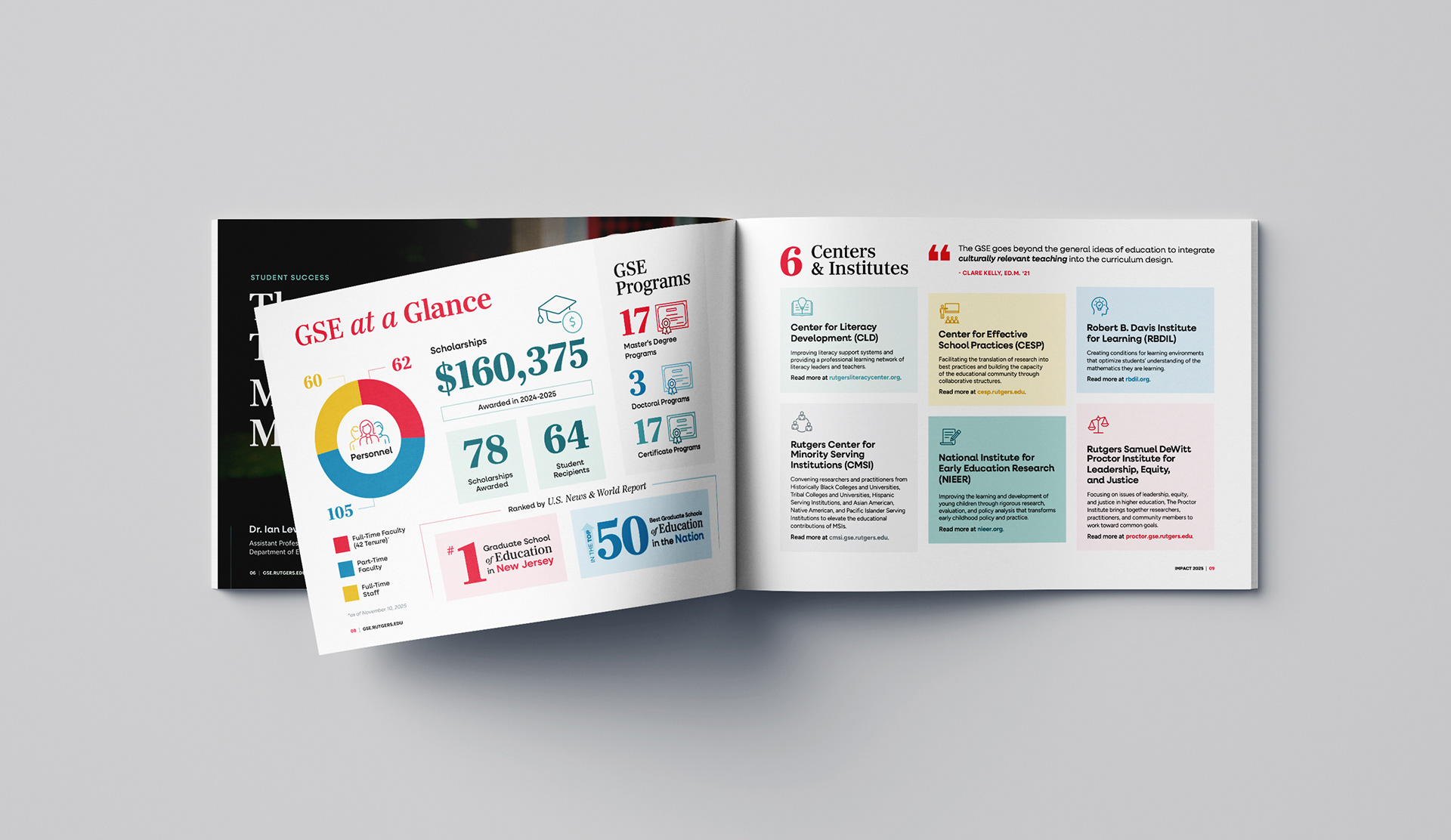
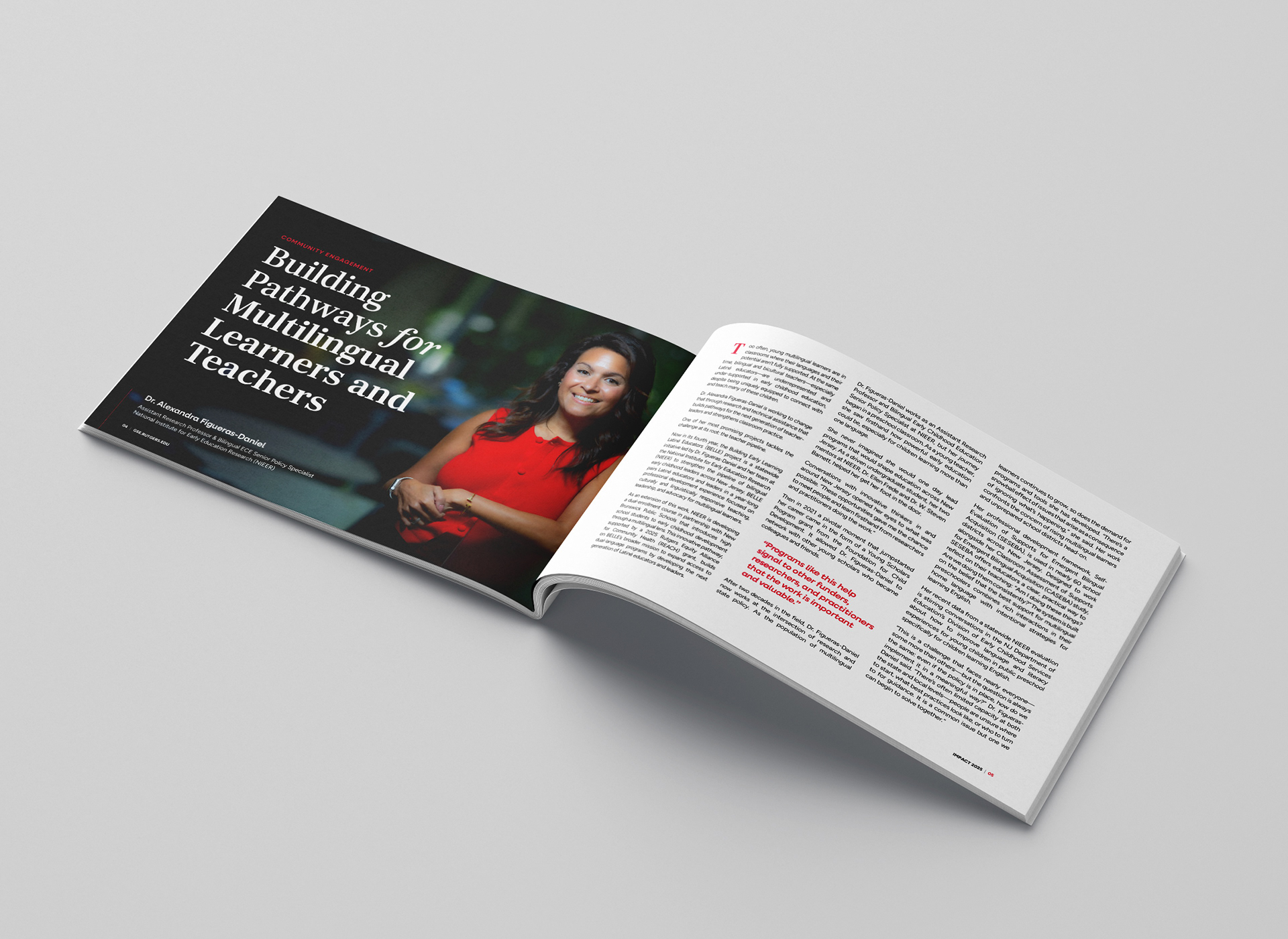
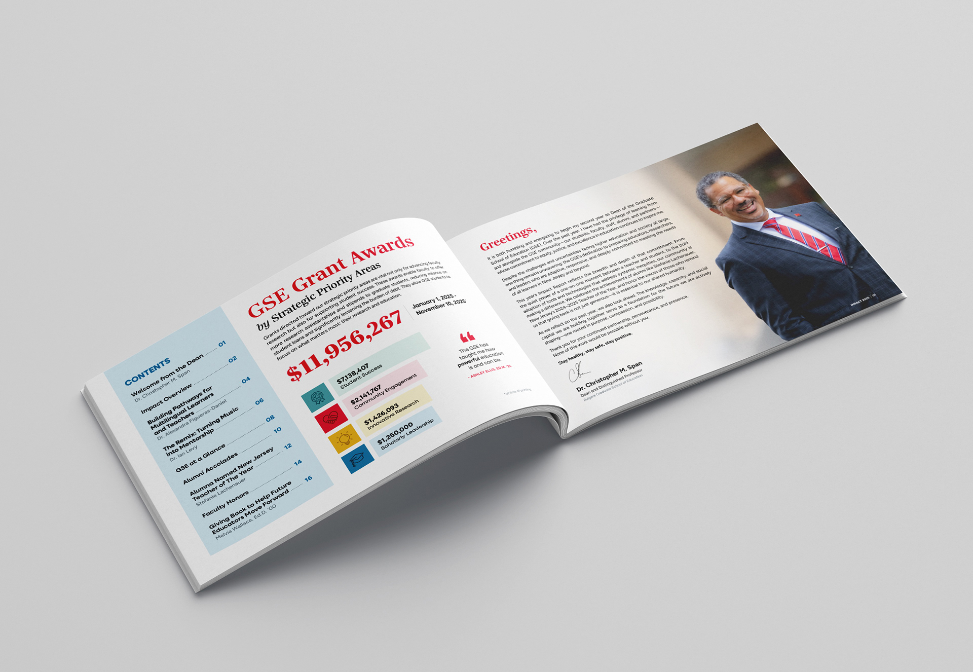
The GSE's annual impact report captures the breadth and depth of the school's work, spotlighting the educators, researchers, and leaders who are actively shaping more equitable learning environments across NJ.
With a strict page count and tight production turnaround, I opted for a horizontal layout to make the content feel more open and readable, and built a clean, modern design using bold typography, strong visuals, and strategic use of the Rutgers brand color palette. The final report balances personal stories with broader institutional impact and was fully optimized for both print and digital distribution. Read the full report here.
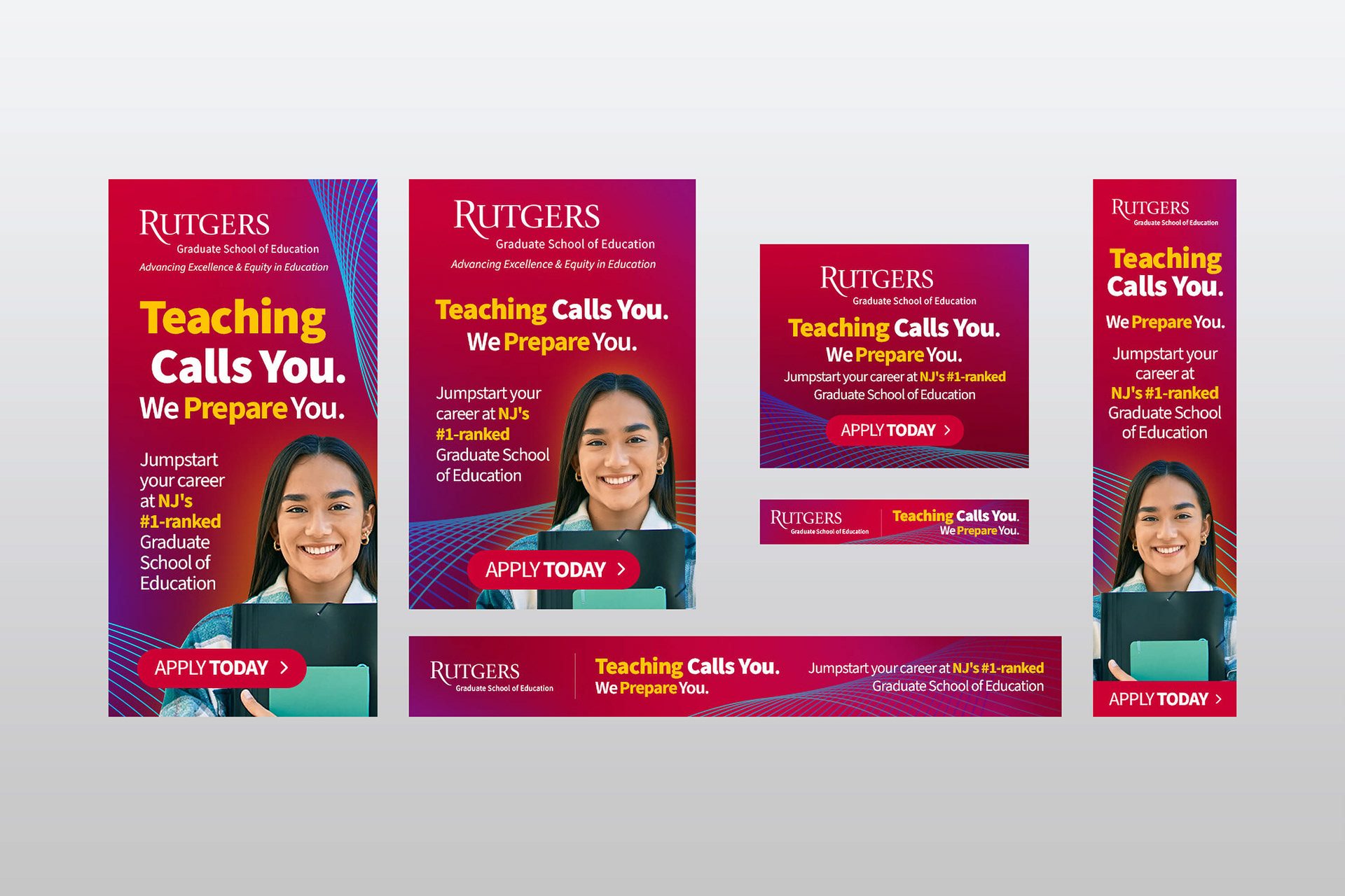
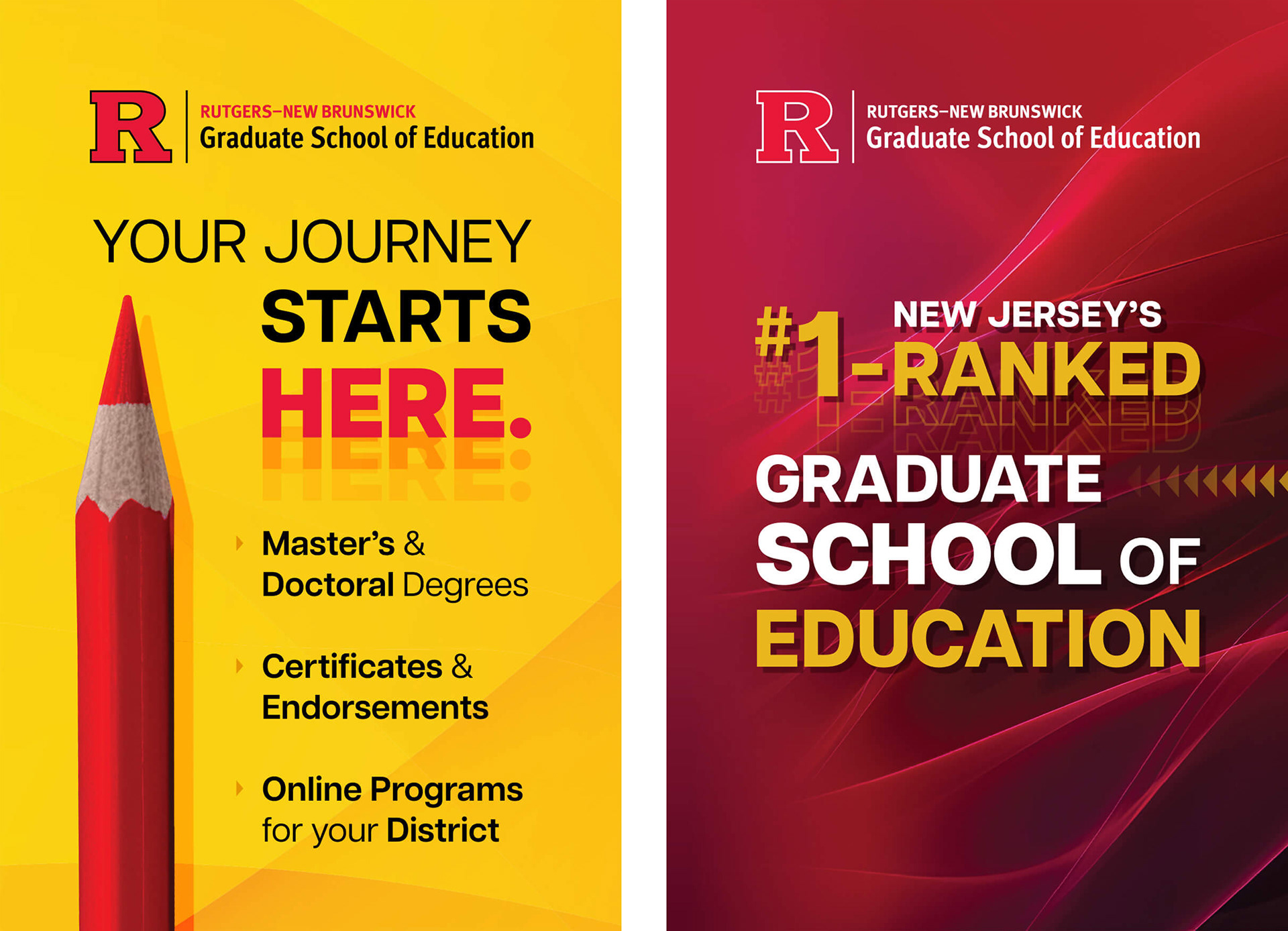
Teaching Calls You - Paid Media Campaign
The GSE wanted to reach undergraduates and encourage them to consider careers in education, so the goal here was to create a visually engaging ad campaign that could stand out in crowded digital feeds. We needed to capture attention quickly, communicate the value and impact of pursuing a degree in education, and introduce a more youthful, energetic look without drifting too far from established brand guidelines.
Since undergrads are constantly oversaturated with digital ads, the messaging had to be concise and compelling, supported by visuals that felt vibrant and playful. I used bold typography, bright colors, and lively patterns to create a dynamic series of ads that translated seamlessly across Google and social platforms. The refreshed campaign contributed to a measurable lift in undergraduate interest—helping drive a 10% increase in enrollment inquiries.

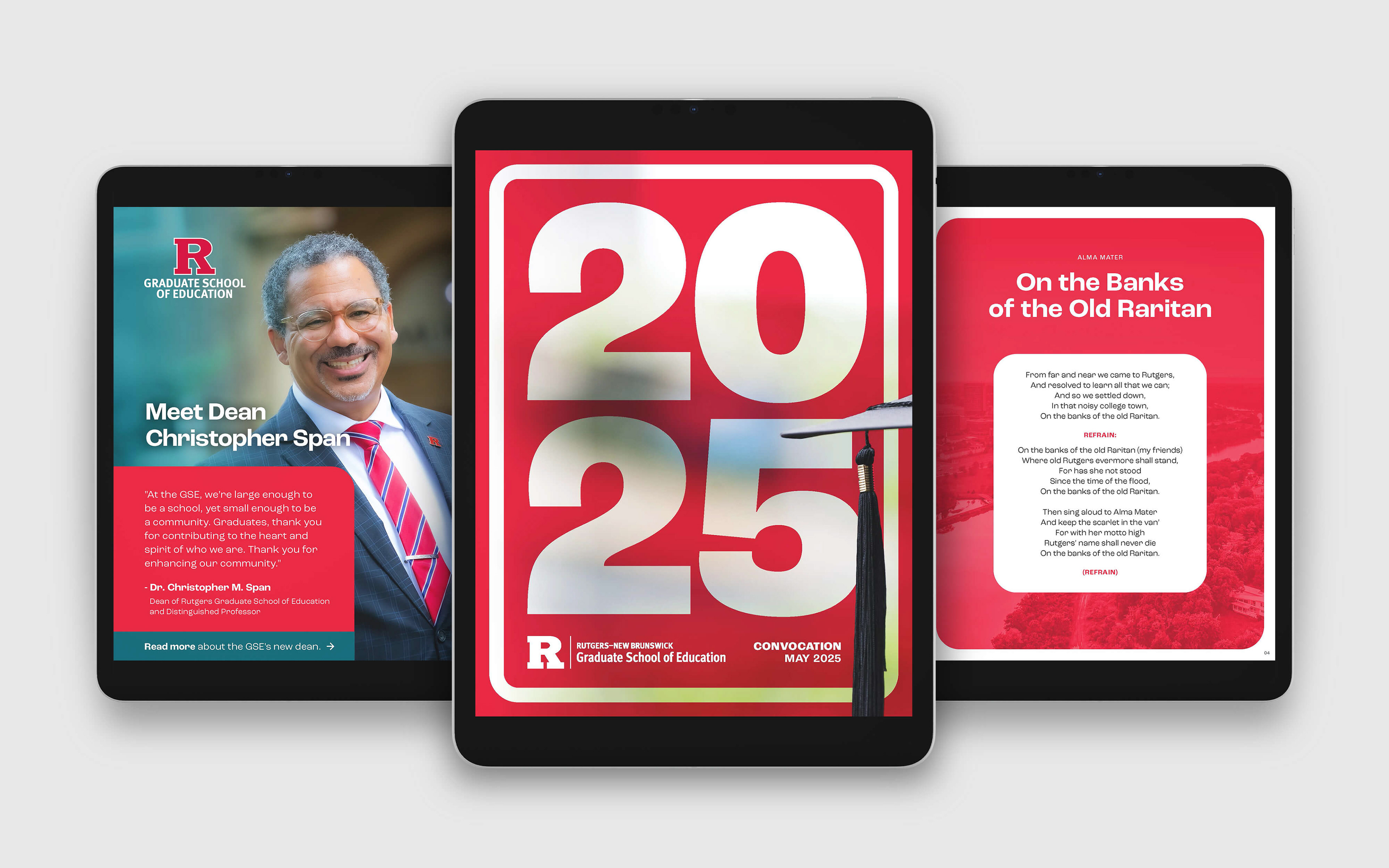
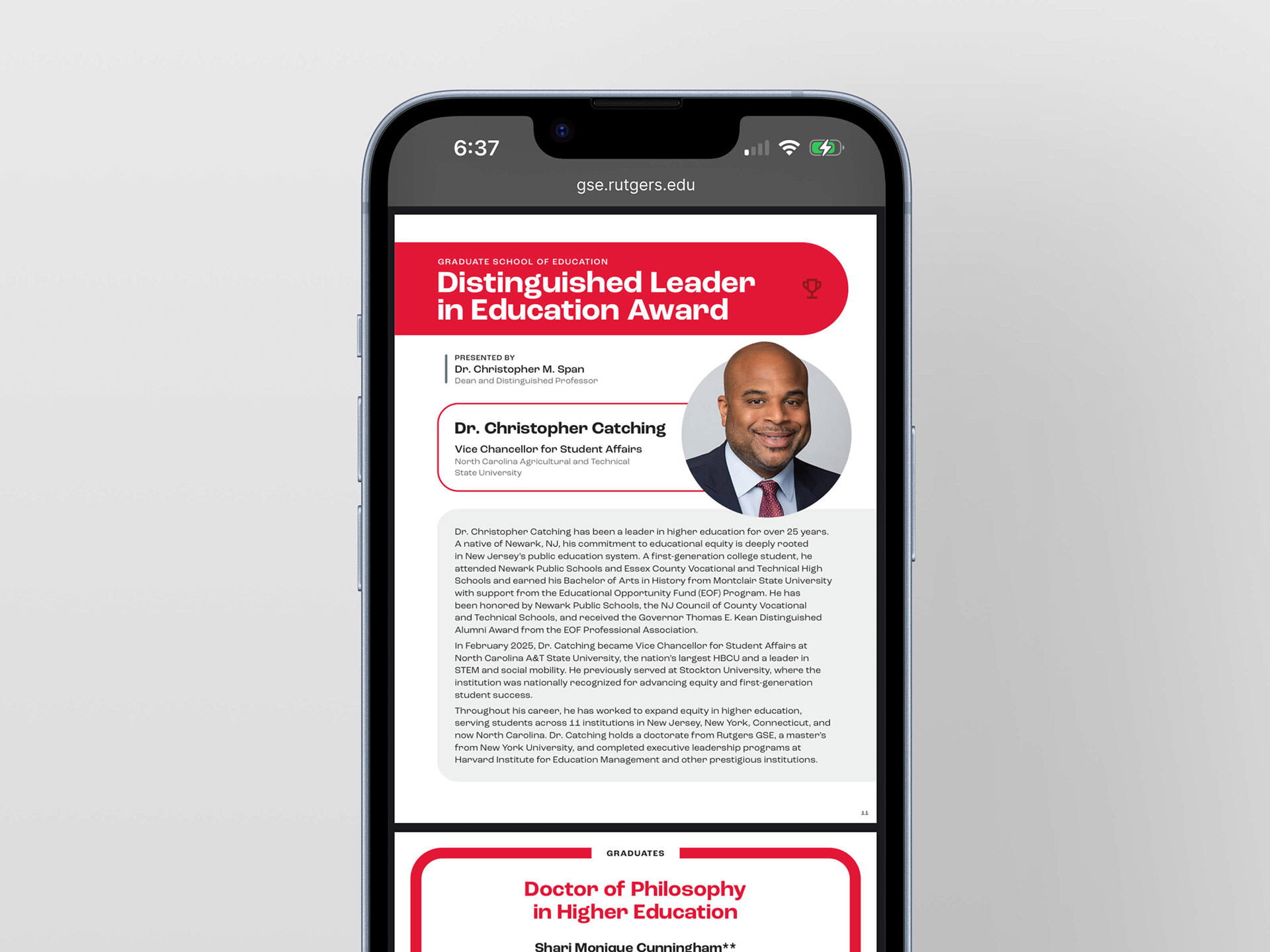
2025 Digital Convocation Program
The GSE needed a digital convocation program that attendees could quickly access during the ceremony, replacing traditional printed programs with a clean, mobile-friendly PDF viewable instantly via QR code. The goal was to provide a seamless alternative to print, ensure easy navigation on phones. Because the program would be viewed on a wide range of devices, the design had to be visually engaging while remaining highly readable on small screens.
I created a lightweight, structured PDF using clear typography, intentional spacing, and strategic Rutgers brand elements to guide the reader’s eye. The final program loaded quickly, supported last-minute updates, and offered a smooth experience for attendees. This ultimately reduce the need for printed materials by more than 75%, which also helped lower production costs.
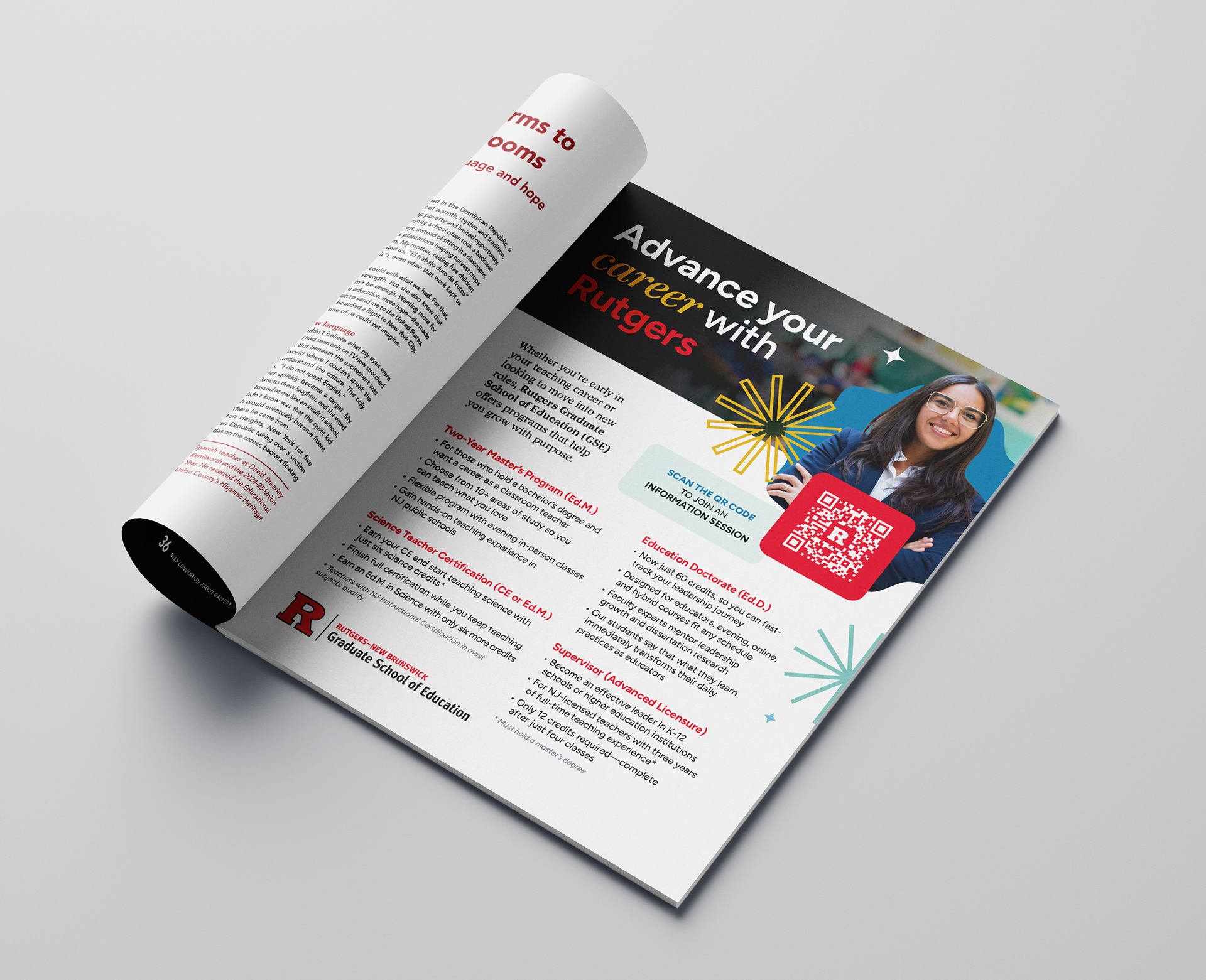
'NJEA Review' Print Ad
The New Jersey Education Association’s flagship magazine, the 'NJEA Review,' is read by thousands of educators statewide. For this ad, we aimed to reach educators at various points in their careers and offer a clear, approachable overview of the GSE’s programs.
The layout is clean and structured, featuring warm, aspirational imagery of an educator paired with star burst elements that add energy and interest. Rutgers’ signature brand colors and a prominent QR code guide readers directly to the GSE’s information session calendar.
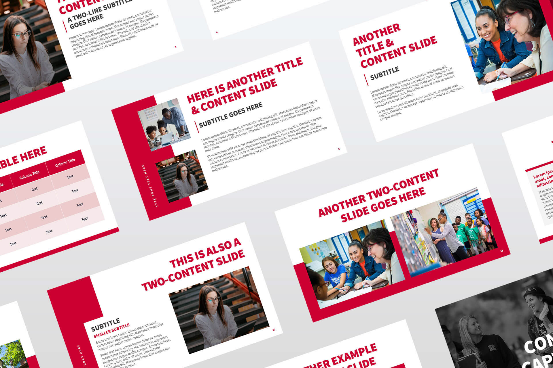
PowerPoint Template
The GSE needed a clean, structured PowerPoint template to support internal communications and presentations, with the goal of creating a flexible deck that any team member could easily adapt. The template had to establish a polished, professional look, align with Rutgers brand standards, offer multiple layout options for different content types, and remain intuitive to edit.
I designed a cohesive template using Rutgers’ core brand colors, clean typography, and a consistent layout grid, along with a variety of slide types—from title and section headers to image-driven layouts and data-friendly formats. Every element was built for clarity and ease of use. The final template strengthened visual consistency across GSE communications and helped increase efficiency and streamline internal presentations.
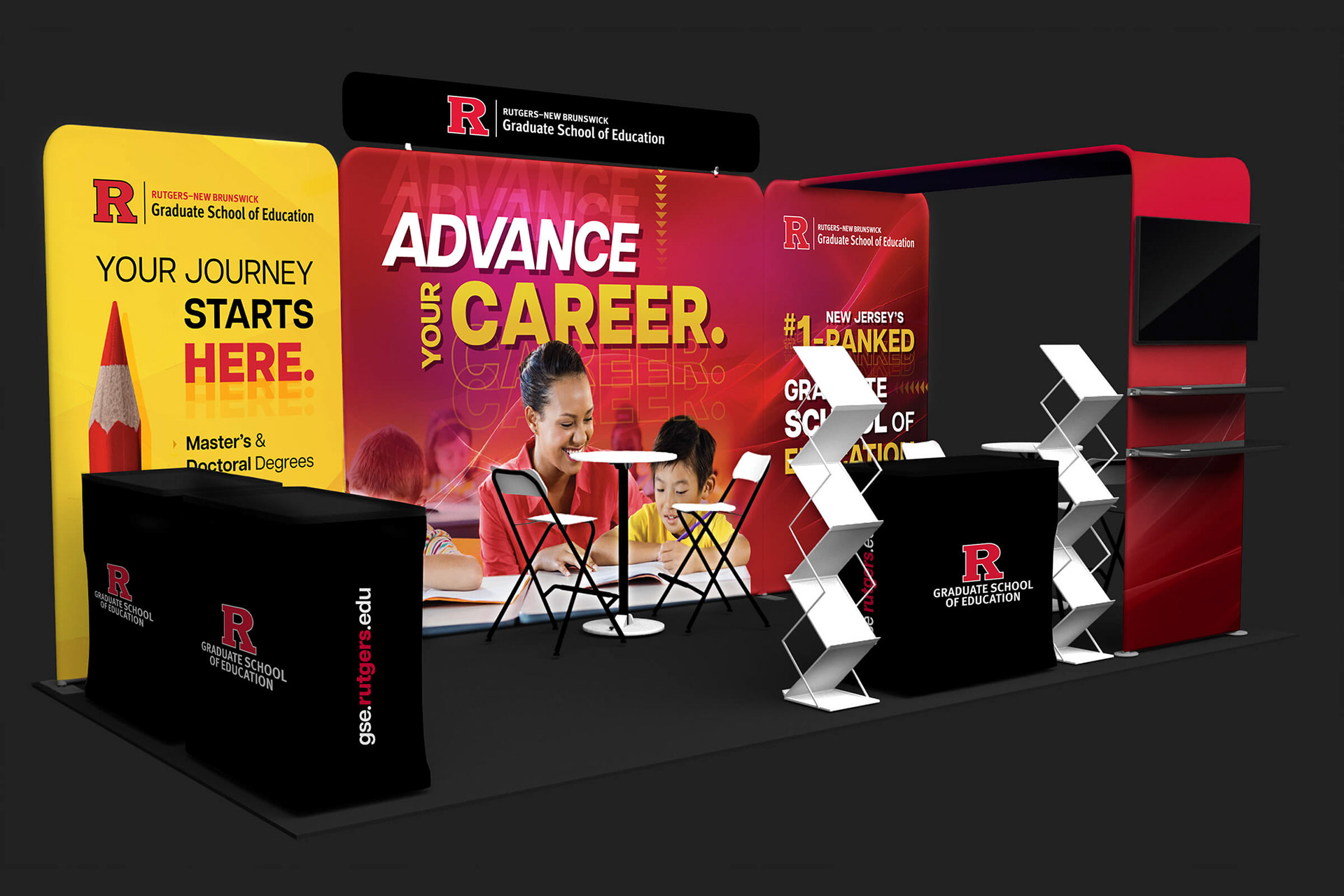
Tradeshow Exhibition Design
The GSE needed a tradeshow exhibition that would attract attendees, reflect the school’s dynamic and approachable brand, and scale seamlessly across multiple events. I designed a flexible exhibition system using bold, bright colors, backlit displays, engaging imagery, and playful yet professional typography.
Modular components allow elements to be removed or reconfigured to fit a variety of spaces, while high-resolution graphics ensure clarity and impact at scale. The exhibition has been deployed at multiple conferences and consistently receives positive feedback for its vibrant, attention-grabbing presence, helping increase booth engagement by over 25%.
Credits
Freelance Creative Director / Designer: Julie Lockwood
Core Contributions: creative direction, art direction, graphic design, print design, paid media assets, digital design, tradeshow booth design